Introduction
In the previous chapter, HTML Forms — Input Types, we covered the most frequently used <input> types in HTML: plain text inputs, password inputs, radio buttons, checkboxes, file inputs, and finally hidden inputs.
While these are surely the most common types, they don't represent the entire range of possibilities held on by the <input> element. There is a wide variety of the kinds of inputs that can be denoted using <input> alone.
In this chapter, we shall go over all these types, one by one. In particular, we'll cover the multitude of <input> types for obtaining emails, URLs, search queries, numbers, telephone numbers, colors, and finally temporal (date and time) values.
This chapter is an optional read in this course because, although the covered input types are worthwhile knowing (and in some cases really important), the core knowledge lies within the basic types that we covered in the previous chapter.
Email inputs
Email addresses are an integral part of today's online, digital world. Almost every other form on every other website requires users to enter their email addresses, either for logging into their accounts, receiving newsletters, or getting order confirmations.
In this regard, we have the specific "email" input type to cater to obtaining emails. An <input type="email"> element represents an email input.
An email input is much similar to a text input; in fact, it can well be said to be a specialized version of a text input, meant to obtain email addresses. For instance, we can enter free-form text in an email input just like we can in a text input.
However, there are a few notable differences to be aware of as well:
- Email inputs typically result in browsers displaying a different keyboard layout on touch-based devices when they get focus.
- Email inputs allow us to easily validate an email address.
Let's dig deeper into the first point...
Email inputs render a different keyboard layout
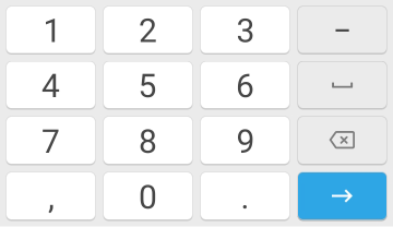
Consider the following figure depicting a keyboard layout on a touch-based Android device when we put focus inside a plain text input (<input type="text">)
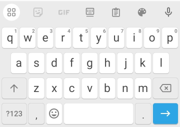
Notice that there's nothing special rendered in this initial view of the keyboard to help us quickly type in an email address. For example, all email addresses require the @ character, yet there isn't one shown on the keyboard for the sake of convenience.
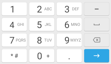
Now contrast this keyboard with the following one, displayed for an email input (<input type="email">):
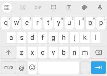
Notice the @ key near the bottom-left corner — it's there because for convenience when entering an email address.
As this example of keyboard layouts demonstrates, whenever we wish to obtain an email address in a form in HTML, we must use an email input (type="email").
This is to provide a good experience to users by having them shown a keyboard which is made to make is as easy as possible to enter an email address.
Moving on, all browsers are configured (in different ways though) to validate an email input automatically, should the user try to enter an invalid email address into it.
For instance, if we enter a value such as hello@ in an email input, and then try to submit the underlying form, the browser will most likely flag an error and hold onto the form's submission, displaying a dialog asking us to enter a valid email.
Following is an illustration (for Chrome):

Anyways, it's time to consider a concrete example of an email input.
Consider the following code, where we present an email input for obtaining...well...an email address: (What else could possibly go in an email input?)
<form>
   <p>Email</p>
   <input type="email" name="email">
</form>Email inputs support an additional attribute, multiple, to cater to the need of obtaining multiple email addresses in a single input.
In this case, the email addresses are delimited by commas (,) and must all represent valid values.
An example follows:
<form>
   <p>Multiple emails</p>
   <input type="email" name="email" multiple>
</form>Open the link above and try entering two different email addresses into the input, delimited by a comma (,), and then submitting the form (by pressing Enter). This should submit both the emails.
multiple, any whitespace characters preceding or following each email address in the input value get trimmed before the value is submitted. So for instance, the value a@b.com , b@c.com becomes a@b.com,b@c.com.Do note, however, that it's NOT a good idea to use multiple on email inputs if we wish to accept multiple emails in an email input. Why?
The snippet below expands upon this.
Why should we not use multiple for obtaining multiple email addresses?
Simply because an email input would feel too crammed up when it has multiple email addresses in it; remember, that an email input is a single-line text input (akin to <input type="text">).
Moreover, we manually need to type in a comma (,) before entering a new email.
It's more appropriate and user-friendly to accept each email address as a separate input (probably using some scripting to allow the user to add a new email input at will, upon the click of some kind of an 'Add' button).
URL inputs
Just like email inputs are meant for emails, URL inputs are meant for URLs. The "url" type corresponds to this kind.
Plus, a URL input is also similar to a text input — a specialized text input meant for obtaining URLs; gets input validation out of the box; and results in a different keyboard layout to easily enter a URL.
A URL input showcases the following keyboard layout:
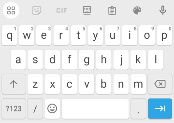
Since entering forward slash (/) characters is common when working with URLs, we get the / key in the keyboard (near the bottom-right corner).
As stated earlier, a URL input itself looks after validating the entered value before submitting it. So for instance, if we enter 'hello world' into the URL, we'll get an error dialog similar to one shown below:
Just like with an email input, we must use a URL input if we wish to obtain a URL. This is so to present users on touch devices with a convenient keyboard layout using which they can effortlessly enter a URL.
Consider the following, simple example of a URL input:
<form>
   <p>URL</p>
   <input type="url" name="url">
</form>Search inputs
Almost every other website these days has a search feature to quickly find content within it. In this regard, we can use a search input to lay out the search field for the underlying search form.
A search input corresponds to the type "search" and simply represents an input where we enter a search query, i.e. something to search.
Functionally, just as with email and URL inputs, search inputs work like text inputs, allowing us to enter free-form text. If you're wondering whether or not we get a different keyboard layout for search inputs, know that we do.
The following figure illustrates this:
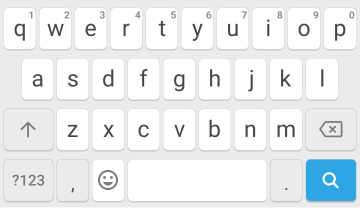
There is only one major difference and that is the key at the bottom-right corner of the keyboard — it depicts a search icon, further emphasizing on the fact that the input is meant for searching.
In the code below, we create a search input for searching something on the entire underlying website (obviously this is a hypothetical example but it's still reminiscent of real-world websites):
<form>
   <p>Search the website</p>
   <input type="search" name="q">
</form>Take note of the name we assign to the search field — "q". What is 'q'?
Well, to start with its meaning, 'q' stands for 'query', and now making the intuition behind its usage, since a search field represents a user's search query, it's sensible to call it as "query", or simple "q".
Other common names include "search" and even "s" (for 'search').
Number inputs
As the name suggests, a number input refers to an input meant to obtain numbers. This coincides with the type "number".
There are many benefits to using a number input for obtaining numbers over using a plain text input.
Firstly, we can't enter letters or just about any non-numeric character into a number input — they simply result in nothing being added to the input.
Secondly, we can easily increment or decrement its value using arrow keys on the keyboard, or using arrow buttons rendered inside the input field when it has focus, otherwise known as a spinbox interface, as shown below:
Thirdly, as with email and URL inputs, but this time more prominently, we get a different keyboard layout for a number input on touch devices, specifically tailored for entering numbers. It's basically a numeric keypad, with large buttons for number keys:
Let's now turn to an example.
In the following code, we render a number input for obtaining a user's age:
<form>
   <p>Age (in years)</p>
   <input type="number" name="age">
</form>We can restrict a number input to a minimum and a maximum number using the min and max attributes, respectively.
When we omit min or max, as in the example above, the corresponding end point of the input's range is unbounded (i.e. it has no limit to it). For example, without max, we can go as far as we want to.
Also, the presence of min and/or max automatically brings in the browser's validation routine for the underlying number input — we can't go lower than min, we can't go higher than max. So, if we have max="10" set, and we try submitting the value 11, the browser will squawk an error.
min and max represent inclusive values. That is, whatever values they specify are considered in the set of valid values for the number input. For example, max="10" means that 10 is included in the set of valid values.Let's augment the previous example to limit the age input to the range 1 - 100 (both inclusive):
<form>
   <p>Age (in years)</p>
   <input type="number" name="age" min="1" max="100">
</form>In this example, the step count of the input, which comes into play when we use the arrow keys (on the keyboard or inside the input field) to increment/decrement the input's value, is 1. That is, using the up arrow key increments the number by 1, and similarly, using the down arrow key decrements the number by 1.
This can be changed by leveraging the step attribute. step specifies the step count of a number input.
By default, the step count is 1, thus allowing only integers to be input. If we wish to allow numbers containing a fractional part — commonly referred to as floating-point numbers — we must specify a fractional step, e.g. "0.1", "0.01", etc.
In the following code, we create a number input to obtain a positive even integer; the min and step attributes come at play here to allow the user to conveniently enter this number:
<form>
   <p>Even integer</p>
   <input type="number" name="age" min="2" step="2">
</form>Notice how we've omitted the max attribute since we don't want to restrict the upper bound for the input.
As a quick experiment, open up the example above, enter an odd integer greater than 2 into the input field, and then try submitting the value. What happens?
Well, we get an error from the browser, as follows:

This is because browsers automatically validate number inputs, given a minimum value (via min) and a step count (via step).
Telephone inputs
The HTML spec also tailors <input> for obtaining telephone numbers. In this case, we use the type "tel", thereby creating a telephone input.
A telephone input, just like a number input, renders a numeric keypad to conveniently enter a telephone number. But there are some notable differences between the rendered keyboards in each case, as depicted below:
For a telephone input, we get letters next to each number key, just like we do on a normal numeric keypad–based telphone device. In addition, we get a couple other keys, for e.g. #, -, commonly used when entering telephone numbers.
Because telephone numbers can contain letters, if we enter letters into a telephone input, unlike a number input, they don't get ignored.
Now, let's come down to an example:
<form>
   <p>Phone number</p>
   <input type="tel" name="phone">
</form>Range inputs
When we have a form input falling in a given numeric range, for e.g. the price of houses to rent, we can use a range input, commonly referred to as a range slider, or just a slider.
Range inputs correspond to the type "range".
The reason why a range input is often called a 'slider' is because of its visual styling. That is, a range input consists of a rectangular bar where a small button (known as a thumb) can be slided to change the value of the input.

As the figure above shows, the bar is filled as far as the position of the thumb, and this filled area is represented with a blue color. This denotes the input's value.
Recall from the section on number inputs above that a number input (<input type="number">) can be provided three attributes to fine-tune the allowed range of values:
minfor the minimum possible value (inclusive).maxfor the maximum possible value (inclusive).stepfor the step count. The default is 1.
Turns out that these attributes are available on range inputs as well, and actually serve more than just fine-tuning the range — they are integral to the creation of a range input.
minis the left-most end of the slider. By default, it's 0.maxis the right-most end of the slider. By default, it's 100.stepis the increment/decrement made as we drag the thumb. By default, it's 1.
The value attribute of a range input specifies the initial position of the thumb. When omitted, value is the mid-point of min and max, i.e. the thumb appears right at the center of the input.
While a range input is a quick and easy-to-use means of selecting a number, there's a big problem with it which needs to be addressed each and every time we use a range input.
That problem relates to the fact that the current value of range input isn't shown to us. For example, if we have our range's thumb at the center, what value does it represent? And how do we even know in the first place where the center is?
The following snippet expands upon this more.
Seeing the current value of a range input
Whenever we use a range input, it's recommended to script it so that as its value changes, that value is output onto the document, thereby clearly communicating to us where we currently are in the range.
The scripting obviously happens taking the help of JavaScript. But talking of the element where to output the value, HTML provides at our dispense a specific element precisely meant for this job — <output>.
We'll see more details to using <output> and how to live-present the value of a range input using JavaScript in the chapter HTML Forms — The <output> Element.
Anyways, let's now consider an example to help clarify all this theory regarding range inputs.
Suppose we have a form for setting up an account on an email marketing SaaS (Software as a Service). Before the service can compute the amount of money due on us to pay to it, it needs us to enter the email subscriber count we're looking after.
In the following code, we create a range input for obtaining this monthly subscriber count:
<form>
   <p>Subscriber count</p>
   <input type="range" name="subscriber_count" min="100" max="10000" step="100">

   <button>Submit</button>
</form>Let's understand the values assigned to min, max, step, and value:
Assuming that the email service can serve at max a count of 10,000 subscribers, the upper bound of the range input is limited to 10,000, and assuming that the service entertains only newsletters with at least 1000 subscribers, the lower bound is 1000.
Moreover, since 100 can be considered as a decent measure of a significant change in the subscriber count of a newsletter, we configure the step count to be 100 (there's no point in keeping the step count at 1, or even 10, because these numbers don't represent significant increases in subscribers).
Lastly, because we don't want the slider to begin at the center point (i.e. a value of 5500) but rather at the minimum point, we manually supply a value which is the same as min.
value from the range input above, its initial value will be 5500. This the mid-point of the min ("1000") and max ("10000") values.So what do you say, was this simple?
Color inputs
If we wish to retrieve a color value in an HTML form, there's an easy way to do so — using a color input, having the "color" type.
A color input is a specialized kind of input meant for selecting from a wide spectrum of colors. We can easily switch between different color systems, such as hexadecimal, RGB, HSL, to select the color of our choice.
The initial view of a color input presents the current selected color:

By default, the selected color is black. To change this color, we need to click on the color input, which results in a color picker being shown, something as follows:
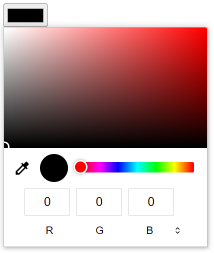
Such color pickers are quite standard across a multitude of graphic design software when selecting given colors, and in that way might not be new to many users.
Whatever color system we use to select a color, the selected color is submitted as a hex value, always consisting of six characters.
So, for instance, if we select pure white using the RGB system, which has the value rgb(255, 255, 255), the submitted value will be #ffffff (even though it can also be equivalently represented as #fff).
And this takes us to the point that in order to initialize a color input with a particular color, we must set its value attribute to a full hex value.
If we consult the specification in this regard, it states that the value of a color input must be a valid simple color, and describes a valid simple color as follows:
A string is a valid simple color if it is exactly seven characters long, and the first character is a U+0023 NUMBER SIGN character (#), and the remaining six characters are all ASCII hex digits, with the first two digits representing the red component, the middle two digits representing the green component, and the last two digits representing the blue component, in hexadecimal.
Quite long paragraph for conveying a simple idea, right? Well, the spec is just so — after all, it's a formal document meant to precisely capture each and every detail.
So for instance, in order to set the initial color to white, we must set value="#ffffff". We can NOT use values like "#fff", "white", or "rgb(255, 255, 255)".
Alright, it's time for an example.
In the following code, we create a color input, initialized to the color yellow, with the hex value #ffff00:
<form>
   <p>Favorite color</p>
   <input type="color" name="favorite_color" value="#ffff00">

   <button>Submit</button>
</form>Temporal inputs
Working with dates and times is more than a routine activity for both frontend and backend developers. Almost every other website that deals with storing stuff in a database needs to work with time at one point or another.
To name a few applications:
- Airline ticketing systems need to know the departure and arrival dates for passengers' return journeys.
- Social media sites need to know the birth dates of their users.
- Appointment scheduling apps ought to know the date/time on which to open up meeting slots.
...and so on.
The point is, getting to work with dates and times in HTML forms won't be an occasional thing for any web developer.
In this regard, when we wish to obtain a date or time input from the user, we can leverage any one of HTML's collection of temporal inputs, i.e. inputs relating to working with dates and times.
There are a total of 5 different kinds of inputs to explore in this sub-category. The following table summarizes these different <input> types, with the value of the type attribute showcased:
| Value | Meaning |
|---|---|
"date" | A date picker. |
"month" | A month picker. |
"week" | A week picker. |
"time" | A time picker. |
"datetime-local" | A date and time picker. |
In this section, we shall quickly go over each of these types one by one.
Date inputs
In order to obtain a date, an option to consider is to use a date input.
The following figure illustrates how a date input looks (on Chrome), along with its date picker dialog:
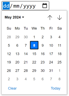
As you can see, the picker presents us with a calendar-like grid view to select a particular date. We can navigate back and forth to change the current month presented to us, along with the current year. And once we have a month selected, the filled square box can be moved around to select a particular date in that month.
If we wish to, we can even manully type in the day, month, and year in a date input (moving to the next segment, once the input has focus, using the Tab key).
Following is an example of a date input for obtaining a user's date of birth (sometimes compactly referred to as 'DOB'):
<form>
   <p>Date of birth</p>
   <input type="date" name="birth_date">

   <button>Submit</button>
</form>Month inputs
As the name suggests, a month input, having the type "month", allows us to conveniently input a month (and a month only).
However, keep in mind that it doesn't just retrieve a month on its own but rather the month of a particular year. That is, we can't just go on and select 'January'; rather, we have to select 'January 2024', or 'January 2023', and so on.
Here's the month picker for a month input (again on Chrome):
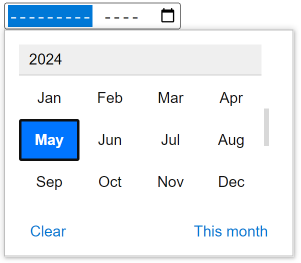
It's worthwhile mentioning here that the support for month inputs across browsers is not very good. Some browsers don't support month inputs and, likewise, don't render any specialized month pickers — they just treat the inputs as plain text inputs.
As always, it's time for an example.
In the following code, we create a month input for obtaining the month of a user's date of birth (possibly for some kind of a survey determining the month with the highest number of births):
<form>
   <p>Month of birth</p>
   <input type="month" name="birth_month">

   <button>Submit</button>
</form>Week inputs
Wanting to ask users to enter a given week is quite an uncommon concern in web forms. However, if we ever do come across one, HTML was got us covered, for we can use a week input for this.
A week input, corresponding to the type value "week", allows us to conveniently choose from a set of weeks (52 in total) for a given year.
The following figure depicts a week input along with its picker (on Chrome):
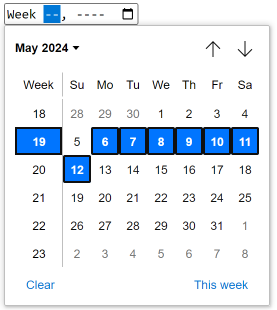
Note that just as with month inputs, the support for week inputs is quite inconsistent across browsers. For those that don't support it, they just render the input as a plain text input. Do keep this in mind before using month inputs in your HTML forms.
There isn't much to cover further so let's get straight to an example.
In the following code, we create a week input asking for...well...a week for something:
<form>
   <p>Week</p>
   <input type="week" name="week">

   <button>Submit</button>
</form>Time inputs
After date inputs, perhaps the second most common temporal input type is that of time inputs. They are given by the "time" type value.
Time inputs, akin to date inputs, have a considerably decent support across browsers, rendering time pickers in most browsers when they are clicked. However, the rendered interfaces aren't the same and vary in different ways.
For example, Chrome renders a time input with a picker interface:
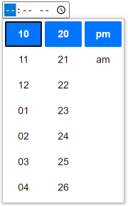
However, Firefox doesn't render any picker; we can use arrow keys to increment each segment of the time input (i.e. hours, minutes, am/pm, and optionally seconds).
Anyways, by default, a time input only accounts for hours and minutes. If we wish to include seconds as well, we must specify the step attribute on the input.
Adding the seconds segment using step
We already saw the step attribute earlier in this chapter for the number and range inputs, where it was used to provide the step count. Know that step serves a similar purpose in a time input, however with a slight difference. That is, the default value of step for a time input is "60", not "1".
But what does "60" mean? Well, the step attribute for a time input specifies the number of seconds to increment/decrement with each step. A value of "60" means that each step increments/decrements 60 seconds, which is the equivalent of 1 minute.
Consequently, if we want to include a seconds segment in the time input, we need to use a step of "1" — it means that each step increments/decrements 1 second.
The submitted value of a time input is of the general form hh:mm, where hh represents the hours, in 24-hour format, and mm represents the minutes, when we don't have the seconds segment.
17:30 being submitted.But when we do have the seconds segment, by virtue of the step attribute, the general form is hh:mm:ss, where ss represents the seconds segment of the underlying time value.
Let's consider an example.
In the following code, we set up a time input without a seconds segment for getting the time at which to automatically publish a hypothetical post (think of this form as a part of a social media website):
<form>
   <p>Schedule for</p>
   <input type="time" name="time">

   <button>Submit</button>
</form>If for some weird reason, this hypothetical social media website requires users to input seconds as well, we can simply give room for the seconds segment by leveraging the step attribute on the input:
<form>
   <p>Schedule for</p>
   <input type="time" name="time" step="1">

   <button>Submit</button>
</form>Datetime inputs
The fifth and final installment in the temporal sub-category of inputs is datetime inputs, represented by the type "datetime-local".
A datetime input is basically an amalgamation of a date input with a time input — we get both the interfaces in one deal.
As always, below we present an illustration of a datetime input on Chrome:
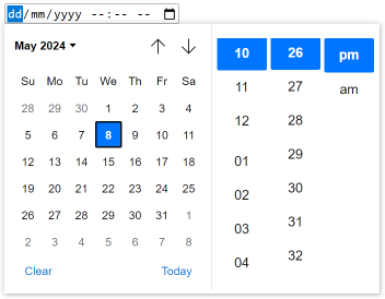
Remember that a browser renders the date and time components of a datetime input the same way it individually renders the date and time inputs. That is, if we're on a browser that presents no picker for a time input, then we'll get no time picker for a datetime input.
Also remember that the step attribute applies to a datetime input as well, and it works the exact same way as on a time input.
The following code lays out a simple datetime input, extending the previous example of a post scheduling form on a hypothetical social media site:
<form>
   <p>Schedule for</p>
   <input type="datetime-local" name="datetime">

   <button>Submit</button>
</form>Notice that we've let go off having a seconds component in the input by omitting the step attribute. To add the component, we simply need to set step.
So now that we have a thorough understanding of all the advanced input types that we were meant to cover in this chapter, there is a small discussion worthwhile having up next.
This discussion is meant to understand which input types covered here are good candidates to actually use in modern-day HTML forms and which ones aren't and should, therefore, be used sparingly, if at all.
Which of these types to use?
With so many input types to consider in addition to the most basic ones that we saw in the previous chapter, HTML Forms — Input Types, it's important to know whether or not there's a good reason to be using a particular type.
Let's start by addressing this question for the easy types we covered in this chapter.
Email, URL, and search inputs
Email inputs, URL inputs, and search inputs should always be used when we want to obtain emails, URL, and search queries, respectively.
They are pretty straightforward to use — just like plain text inputs — and render desirable keyboard layouts for us to enter the respective data very easily. No questions in their usage.
Number and telephone inputs
Similarly, number inputs and telephone inputs should also be used always when we wish to obtain arbitrary numbers and telephone numbers, respectively.
Once again, both number and telephone inputs render desirable keyboard layouts for us to conveniently enter given numbers, plus the submitted values for them resemble the actual values entered into the input fields (that is, there's no need to guess about the format of the submitted data).
This leaves us with three types: range, color, and temporal (itself including 5 types).
Range inputs
It's completely fine to use range inputs when we don't want precise measurements of something and at the same time prefer to have the user select from a range of values.
Range inputs have a good support across browsers, rendering more or less the same interface element, and therefore there's no harm at all in using them.
Color inputs
The same goes for color inputs, that is, we should use color inputs for obtaining color values. Surely, every browser has its own color picker interface, but the point is that there is at least one in place and that it should be leveraged when we want to put a color field in a form.
Temporal inputs
We're left with temporal input types. Unfortunately, the case isn't this simple with them.
As we saw above, there isn't a single standard interface for different temporal input types (for example, on Chrome, month inputs render a month picker, whereas on Firefox, there is just no picker at all). In addition, it's a little bit work to navigate to the correct temporal value when using a native browser date or time picker.
This means that temporal input types should be used with caution. There are better alternatives for obtaining dates in HTML forms than to use date- or time-specific input types.
As a quick example of this, we can very easily lay out the date of birth (DOB) field of a form as a group of three <select> elements: the first one representing the year, the second one representing the month of that year, and the third one representing the day of that month, when the user was born.

